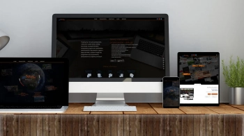
Learn what are the differences between a mobile version website and a responsive web design (RWD) website.

Author: webSylium
Publish date: 2023-07-20
A website adapted for display and convenient use on smartphones and tablets is often referred to as a mobile website or responsive website.
For the end user, it may not make any difference. But there is no small difference between the two concepts.
Serwis responsywny
RWD (Responsive Web Design) is a term describing the technique of designing websites in such a way that it is possible to adapt the layout of the website to any screen resolution in a controlled manner (as a rule of thumb, 3-4 resolution thresholds are adopted for which the website is to use the appropriate CSS style sheet).
The main idea behind responsive websites, is that the end user receives the same response from the web server, regardless of whether the request was sent from a phone or a desktop computer. The server will always send the same data to the browser and the "magic of responsiveness" will work only on the client side. More precisely, in the browser of the device, which will re-render the appearance of the site according to the appropriate CSS style sheet declared for a given resolution range.
By loading the appropriate CSS sheet, the browser can visually modify (i.e. rearrange, enlarge, reduce, etc.) display or hide some layout elements (e.g. hide the slider). Display the navigation menu in a form adapted to touch devices where there is no hover effect on the element (hover) only click.
When designing a website, the proper array, order and nesting of the structural elements of the website is not without importance. It must be an array suitable for different resolutions, and only on the basis of the style sheet do we change the appearance because the physical design of the website and the content is unchangeable.
It is also worth mentioning that graphic elements in a responsive site must be universal and scaled by CSS, which often affects the performance of the site. A smaller graphic file could be sent to the browser on a smartphone, but it is as we pointed out in the introduction that the server to the client always sends the same response with the same content.
Mobile version of the service
The mobile version of a website is usually a separate service dedicated to mobile devices. When a client sends a request to the server from a mobile browser, the server recognizes such a request and redirects to the address of the mobile site.
As a rule, there is a redirection to a subdomain, e.g. from the address http://onet.pl to the address http://m.onet.pl (it should be noted that the redirection also works the other way, when you want to call the address of a mobile service from a desktop browser, you will be redirected to a service designed for standard browsers).
With such redirection, already at the server level you can decide what kind of response to send to the client's browser. You can then send to the mobile browser a response with a completely different design, with different content and graphic content (e.g. with optimized small graphics) with a completely rearranged order of structural elements, then you do not need to hide unnecessary elements because they are not sent to the client at all.
How to check if a website is adapted to mobile devices?
This is easily verified with a tool provided by Google, available at: https://search.google.com/test/mobile-friendly

