
RWD (ang. responsive web design) - to technika projektowania layoutu, która umożliwia dostosowanie się układu stron WWW, sklepów oraz portali do rozdzielczości ekranu urządzenia na którym są wyświetlane.
In responsive websites, not only the website layout but also the navigation is modified, some elements are hidden or replaced with others - so that the functionality and efficiency are at the highest level.
When a classically designed website is launched on a smartphone or tablet, it is scaled down in proportion to the resolution with all elements kept identical, which often requires manual enlargement of the screen and makes it difficult to navigate the website - that's why more and more responsive websites are now being created.
All the websites we implement (with or without CMS), web portals and online store since 2014 are made as standard responsive designs to decide their appearance on mobile devices.
So that our customers' customers can quickly and easily reach the information they are interested in, so that they can make purchases while riding the bus.
Customer review
Thanks to the webSylium company, the desired effect of my company's website in every element has been achieved. This is evidenced, among other things, by the visits of my clients to the site and the incoming comments relating to the professionally designed site.
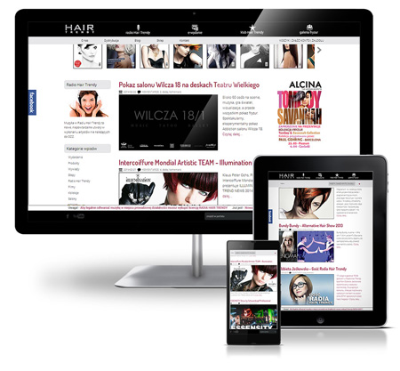
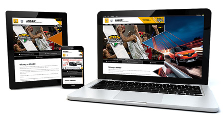
See examples of our responsive design implementations (compare how the site looks on smatphone, tablet and PC):
If you need professional implementation in responsive technology, contact us! From over 12 years, all our implementations are responsive as standard.